Business & Tech
Cure Your Home's Color Confusion
Painting is the cheapest, most affordable way to transform your rooms — you just need some inspiration, unity and experimentation.

I have a theory that paint companies try to calm people’s fears about selecting paint by naming the colors with comforting titles like Grandma’s Sweater (a medium blue) and Happy Camper (a spring green).
But the truth is that most people are overwhelmed when choosing colors for an entire room from a 2 inch square sample. I often find that people just decide to “play it safe” by painting the walls white – after all, white matches everything – right? Unfortunately, the result is a room that feels cold and unfinished and the homeowners wonder why it doesn’t work.
I’m not saying that white walls are always a bad choice but they have to fit in with the overall color scheme of the space and appear in more than one place in the room. Only you can decide how much color you are comfortable with. Start by asking yourself several questions and hopefully a style will emerge.
Interested in local real estate?Subscribe to Patch's new newsletter to be the first to know about open houses, new listings and more.
- Are you drawn to warm or cool colors?
- Do you look best in certain colors? Check your closet for a clue on your favorites.
- What type of feeling do you want the room to have – calm or energetic?
- What colors from nature appeal to you?
Get inspired
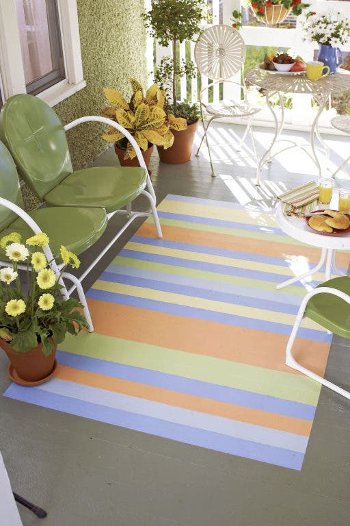
Once you have decided the “feel” of the space – look for a point of inspiration. You may be able to draw from an existing rug, upholstery or a favorite painting. It is much easier to find paint to go with fabrics and rugs than the other way around.
Interested in local real estate?Subscribe to Patch's new newsletter to be the first to know about open houses, new listings and more.
Work with three colors in a room will give it balance and is an easy way to pull a space together. Find the least dominant color in your inspiration piece and use that as your wall color with a mid-toned color on the floor and large pieces of furniture. Use the brightest color for accessories, pillows, etc. Repeat colors evenly around the room and in at least three places.
Experiment
If possible, take your inspiration piece (or a photograph of it) to the paint store and try to pull out paint swatches that match the piece. As you compare the gradations of the colors from light to dark on the strip, choose a shade that you will be most comfortable with. I would suggest that you purchase a small amount of the paint (most major paint companies now offer small cans of paint for that purpose) and cover a large poster board with the color.
Move the board all around the room and view it at different times of the day, viewing it in the darkest corners as well as by the window. Keep in mind that when used on four walls, the color will usually appear darker. Color is also affected by the amount of light in the room and by whatever colors are next to it.
Tie it together
Consider the flow from one room to another since in many homes you can see one room from the next. All the rooms need not be painted the same color but they should be at the same level of intensity. For example if you choose the 3rd color down on a paint swatch, it works best if the colors in surrounding rooms are also the 3rd color down. Another way to help the flow is to paint all the woodwork the same throughout your home. This will draw the eye from room to room and be a consistent thread throughout.
More color tips:
Off-white and light colors highlight a room’s size.
Darker colors add warmth and make a space feel cozy.
Don’t forget the ceiling – if it is over 8 feet high, painting it a tint of the wall color makes the room feel more intimate.
If you are shy about a color, paint one focal wall in a bold color and paint the other three in a soft neutral shade.
Color cues: Colors can evoke emotions:
Red demands attention and stimulates the appetite.
Yellow will give your space a cheery lift.
Green is soothing and is nature’s favorite.
Blues remind of us of calm waters.
Brown is a sophisticated color or can be a neutral in a beige tone.
I once helped a woman choose a paint color for her dining room. She had a successful bakery business and as we looked through the samples, we settled on a beautiful rich red color that picked up on the print in her window treatment. It was the perfect color and as we flipped over the sample card to make note of the name – it was called raspberry truffle – of course!
We love you. Reciprocate! Follow us on Twitter or like us on Facebook.
Begin by identifying what architectural features are a permanent part of the room – brick around the fireplace, dark stained floors and also the elements that will remain in the room – upholstered furniture, an area rug.